How Does Colour Impact Graphic Design? Unlocking the Power of Hue and Emotion
Ever wondered why some designs instantly catch your eye or evoke a certain mood?
The secret often lies in the clever use of colour.
In graphic design, colour isn’t just decoration—it’s communication. The right hues can trigger emotions, influence decisions, and shape how your audience perceives your brand.
???? The Power of Colour in Design
Colour plays a critical role in visual storytelling. Beyond just looking good, it has the power to:
-
Evoke emotion
-
Reinforce messaging
-
Drive action
Designers use colour intentionally to guide perception and make messages more impactful. In fact, entire careers exist around colour theory and consulting, proving how essential it is to the creative process.
???? Why Colour Matters
Colour speaks louder than words. It influences how people feel about a product, brand, or message—often subconsciously.
Studies show up to 90% of product assessments are based on colour alone. That means your choice of colour could be the difference between engagement and indifference.
Factors influencing colour perception include:
-
Cultural background
-
Gender
-
Age
-
Personal experience
Understanding colour psychology helps you create designs that are not only visually striking, but also emotionally resonant.
???? Exploring the Emotional Impact of Colours
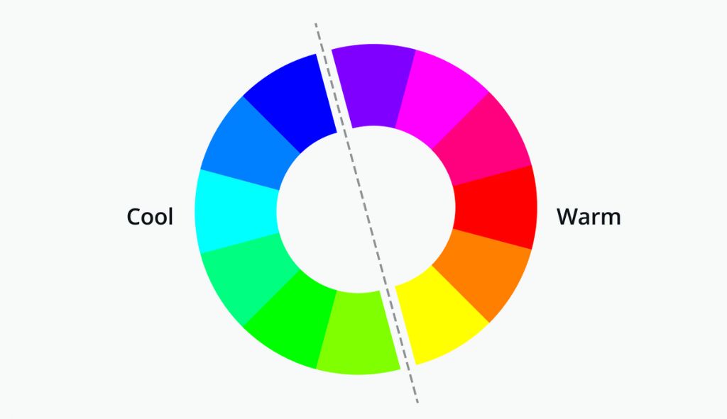
???? Warm Colours
Warm hues grab attention and generate energy.
-
Red: Passion, love, power, excitement — but also anger and urgency.
-
Yellow: Happiness, optimism, and clarity — yet sometimes frustration or caution.
-
Orange: Energy, friendliness, health — often used in promotions or seasonal themes.
???? Cool Colours
Cool tones are calm, professional, and trustworthy.
-
Blue: Stability, peace, and trust — but can also feel distant or sad.
-
Green: Nature, health, growth — yet may suggest envy or greed.
-
Purple: Luxury, creativity, and spirituality — often linked to royalty and imagination.
⚫ Neutral Colours
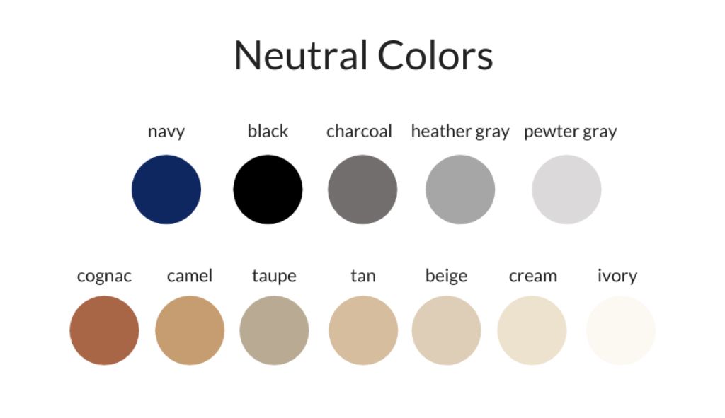
Neutral colours bring balance and allow accent colours to shine.
-
Black: Sophistication, power, elegance — but also mourning or mystery.
-
White: Simplicity, cleanliness, purity — but can feel cold or sterile.
-
Gray: Professionalism and balance — yet might evoke gloom or indecisiveness.
-
Brown & Beige: Warmth, reliability, comfort — but can come across as dull.
???? Mastering Contrast with Colour
Contrast isn’t just about standing out—it’s a design essential.
Why Contrast Matters:
-
Draws Focus: High contrast helps the viewer quickly identify key elements.
-
Strengthens Message: Colour contrast reinforces tone and intent.
-
Shows Hierarchy: Guides the viewer through your content in a logical order.
Pro Tip: Use colour contrast wisely to highlight buttons, headlines, or calls-to-action.
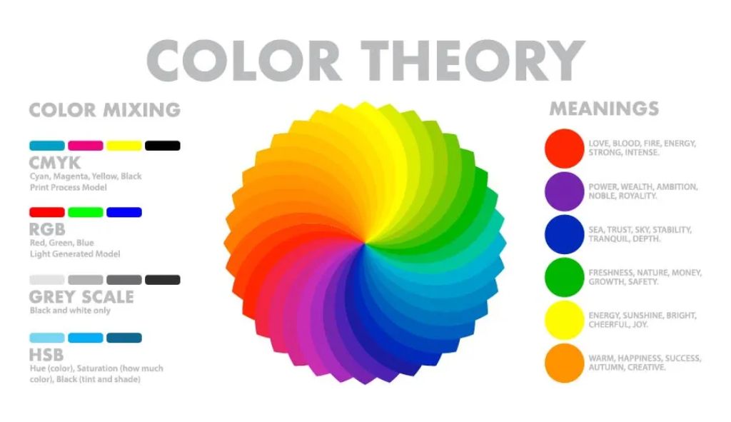
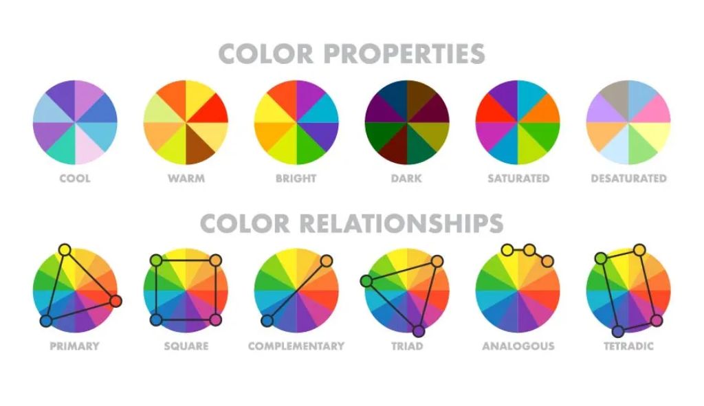
???? The Science of Colour in Graphic Design
Great design doesn’t require artistic talent—it requires an understanding of how colour works.
To master colour:
-
Learn about colour theory and harmony
-
Study emotional and cultural associations
-
Practice creating designs with purposeful palettes
Over time, your ability to intuitively pair and apply colour will make your visuals not just attractive, but unforgettable.
✅ Conclusion: Colour Is the Heart of Design
Colour isn’t just a finishing touch—it’s the foundation of communication in design.
When used with intention, colour can:
-
Connect emotionally with your audience
-
Build strong brand identity
-
Influence decisions and behaviour
So next time you start a design, don’t ask “What looks good?”
Ask, “What do I want people to feel?”
Want more insights on design, branding, and digital marketing?
???? Visit DESS for strategic support that helps your brand stand out and connect.